Building the Perfect Website for Your Business
Ready to launch the ideal business website? Master the essential blend of design psychology, SEO strategy, and user experience (UX). Learn about key elements like mobile responsiveness, speed, and effective CTAs, and get a rundown of the top website development tools for today's market.

Introduction:
“Do you know that 75% of consumers judge a company’s caliber based on its website?”

A website is not just simply a virtual address with some mixed numbers and alphabets. It’s an initial impression of your digital storefront and a crucial deciding factor that a random visitor will or will not turn into your customer.
Picture it: You started walking in a digital website marketplace. There you consider every stall you see as a website. Some look dull for you, Some barely catch your eye. Others? They just glow and glitter. They start to hook you with vibrant colors, smooth navigation, and stories that speak directly to you. They aren’t alone just websites, they are mere experiences. They’re built on questions “what,” “why,” and “how.”
You’ve read it this far, haven’t you? That means curiosity has already started riding in your mind and seeking to ask the big questions.Let’s find the answers together for the built on questions very soon.
As a UI/UX design company in Chennai focused on user-centric and conversion-driven experiences, we recommend this approach to clients who need intuitive design without unnecessary complexity or high costs.
What does “Perfect” mean?
Not all fingers are the same, likewise not every business needs the same kind of website. Then how the word "perfect" will be edible here in this blog, A "perfect" website doesn’t mean anything so flashy or something complicated it means one that achieves your business goals effectively while delivering a great experience to your day to day users.

So, In this blog, I am about to walk you through the essentials of building the perfect website for your business. Let’s dive in.
What, Why, How — The Foundation of a Perfect Website
.jpeg&w=1920&q=75)
1. What is a perfect website?
It’s not just a cover up of animation and design all of more than just a digital presence. A perfect website is a 24/7 salesperson, a storyteller of your brand, and a trust-building hub. It is entirely going to be the central point of your digital strategy which connects your audience to your offerings effortlessly.
2. Why does it matter more?
As we are living in the era of short attention spans and more filled with audiences who are already saturated with digital noise, your website might be the only to stand out from others. And why is it so vital?
- First Impressions Stick: Visitors' mentality decide whether to stay or leave your site in less than 10 seconds.
- Trust Equals Transactions: Trust is a fragile one in today’s online world. One clunky page will quietly drive your visitors to your competitors.
- Every Click Counts: So, your competitors are just one click away.
3. How does one actually build a perfect website?
There is no universal template that one can do a CTRL+C and CTRL+V - there is a proven process for a strong foundation. Scroll it below!
Define Your Goal: What is the purpose? What is in your mind? Your site must look like a reflection for those questions. Is it to generate leads? Sell products? Educate?
- Know Your Audience: A great website speaks the language of its users. Everything from tone to layout must resonate. So, cook a good one for them. They should feel like Bravo!
- Craft a Smooth UX (User Experience): Easy to navigate, seconds for loading, mobile responsiveness, and intuitive CTAs are and all non-negotiables.
- Design to Create Impact: Use your own brand colors, strong catchy visuals, and do spacing wisely. The goal? is to Guide and to Grab the visitor’s attention.
- Write with Clarity: Make the content to inform, as well as engage, and to drive a solid action. From the start of the “About page to till the Contact us page” content all are matters.
- Optimize Everything: For search engines (SEO), for boosted performance, and for easy accessibility. A perfect site does not need to be just pretty, it should be smart.
- Iterate Often: A successful launch is not just the beginning, real growth happens only if there is ongoing testing oftenly, Polishing the website based on user comments , and continuous optimization.
Key Elements Your Business Website Must Have

1. Branding & Consistency
Your website is an extension of your brand, make it more visually and develop it to connect with the user emotionally.
- Use a consistent visual identity: Apply eye attractive colors, apply typography like technique, and appropriate logo placement should make the consumer feel familiar and professional.
- Align your tone of voice with your brand personality so make it formal, quirky, or bold.
- “Cohesion builds trust”. When your site feels and looks polished and properly aligned, it signals that your business is too.
💡 Tip: A consistent brand experience increases revenue by up to 23% across all channels.
2. User Experience (UX) & Navigation
If a user can't find what they need in seconds, they won't stay and scroll. So, user engagement plays a vital role
- Keep your layout more intuitive, with a simple menus bar and logical page structure in an ordered format.
- Keep user navigation to a more minimalistic 3-click rule: any important page should be reachable within 3 clicks.
- Provide visual cues to your user and set clear pathways so that visitors feel like they are getting guided, not in a lost state.
🧭 If users get lost, they leave. Simple navigation = better engagement.
3. Mobile Responsiveness
If your site isn’t mobile-ready, it means you’re already behind in the game no second chance will you get.
Over 60% of traffic on the web now comes from mobiles. Let’s be real not everyone owns a laptop, but nearly everyone has a smartphone in their pocket. Your audience is literally tapping through life, so try to meet where they are
Adopt a mobile-first approach. That means:
- Finger-friendly buttons (no one will likes to zoom and squint)
- Develop legible fonts that adjust across screen sizes accordingly.
- Minimalistic layouts that will load quickly and feel more intuitive
Remember: mobile-first isn't a design trend, it's survival logic.
📱 “The entire ocean of digital experience fits right in your palm. Why settle for a puddle?”
4. Speed & Performance
First impressions always matter. Think of your website like a first date where you've got some seconds to impress someone. If your site lags or fails to impress, then your visitor will bounce you out and someone else wins the deal.
- Compressing images, leverage browser caching, and use a fast-loading theme.
- Ditch unnecessary plugins and bloated scripts they're dead weight
- Always invest in good hosting because a luxury car can’t race on a broken road
⚡ A 1-sec delay in page loading can reduce conversion cost by up to 7%. Speed doesn’t just impress, it converts.
5. SEO Basis
You can’t convert what you don’t attract. Your website might be stunning in visuals, but without SEO, it’s like a billboard placed in the desert.
Build your SEO foundation with:
- Strategic keywords present naturally into your content
- Have Meta titles, Descriptions, and Proper Heading Hierarchy
- Clean, human-readable URLs
- Alt-text on all images for accessibility and ranking
- Schema markup to help search engines better understand your content
🔍 SEO isn’t a one-time task it's a fuel that keep your website visible.
6. CTAs and Contact Access
If you don’t open the door, then don’t expect anyone to walk in.
- Guide users with clear thoughts, make it visible to make Call-To-Actions or like “Book a Demo,” “Get in Touch,” or “Try Now.” Using this makes them connected.
- Place contact info strategically: header, footer, and add a dedicated contact page.
Place your contact info where a user's eyes naturally go in the header, footer, and a dedicated page.
Add multiple communication channels in forms, live chat, email, and even WhatsApp or social DMs. “Friction is your enemy”; accessibility is your edge.
📞 Make it easier to contact you than to close the tab.
Design Psychology That Works

Imagine this: Let’s take two persons A and B. They have started entering two different rooms in one building. Where the room that person A is entered is so quiet, the walls are painted a soft blue in color. And there is natural light filtering through sheer curtains, a desk in the corner which is neatly arranged, and a comfortable chair that invites the person to sit. Also to feel calm and more safe. Now let’s look how the room looks like that person B had entered. Colors are painted in red on a bold wall, the shelves look cluttered, flashing neon lights, five different fonts scattered across a poster. The person B felt like that he entered into a horror room leads his pulse quickens. Feels distracted, even more anxious too. They haven’t spoken out about what they experienced but their brain has already made a decision. And there comes the power of design psychology.
💡 Insight: Our brain will take some quick decision without even thinking twice. We can also define it in the term “reflex”.
What happens in rooms will happen on websites too. Every digital space tells a story before a single word is read. When a visitor lands on your page, their mind starts racing through a silent checklist activity that is carried out in one person’s subconscious mind: “Does this feel safe? Is this trustworthy? Do I belong here? Is this worth my time?” And guess what it's not the words that answer those questions. It’s the colors, the fonts, the spacing, the layout and the design. Your website is not just being seen. It’s actually being felt.
Design psychology is not about decorating your website, it's about directing behavior.
1. Colors, Fonts, Layout, and Visual Hierarchy

🎨 Colors: A magical one which connects at your soul.
Have you ever noticed why most of the finance brands chose the color blue? Or why fast food giants prefer the color red and yellow? Consider it as a puzzle and think?
That’s not a coincidence, that's design psychology that comes to action.
Colors influence emotion and show perception. They’re processed by the limbic system, that is the part of the brain that controls human feelings and memories.
- Red = urgency, appetite, passion
- Blue = trust, calm, stability
- Yellow = optimism, energy, attention
- Green = growth, safety, peace
- Black = power, elegance, mystery
- White = clarity, cleanliness, simplicity
💡 Tip: Pick your color palette not in the basis of what will “looks good” but get to know what feels right for your audience. Color can make someone trust you or turn away without even knowing why. It Looks like tossing a coin, it’s a sacred one.
🔤Fonts: The Silent Voice Behind Every Word
Typography isn’t just all about legibility it’s the tone of your own brand's voice.
Think of the fonts as the outfit of your words that you're gonna wear.
- Serif fonts (like Times New Roman) that suggest tradition, respectability, and more professionalism.
- Sans-serif fonts (like Helvetica) feel clean, modern, and minimal.
- Script fonts feel personal, creative, or luxurious but can also be hard to read.
- Display fonts grab the attention best used in moderation.
A font mismatch is like wearing a clown wig to a business meeting. People may not know why it feels off, but they’ll know something’s wrong.
💡 Tip: Your font should match your message. Are you bold, elegant, friendly, edgy? Your typeface should whisper (or shout) that personality.
📐Layout & Visual Hierarchy: The Path Your Eyes Follow
Have you ever landed on a website and felt what a crap it’s like you didn’t know where to look?
That’s a layout failing to honor and to attain the visual hierarchy.
Your brain looks for a craving to get order and guidance when it is facing something new. So, a well-structured design naturally grabs the viewer's attention from most important to least important using:
- Size: Bigger elements catch the eye first
- Color/Contrast: Bright or bold elements pop
- Spacing & Alignment: A Clean structure creates comfort
- Positioning: Top-left gets more attention than bottom-right
💡 Tip: Every layout we can take as a map. You’re guiding a user from Point A (curiosity) to Point B (action). A Good visual hierarchy removes the friction and doubt.
2. Minimalism vs. Overdesign
There comes the big debate: Should you strip your design to the bare bones, or decorate it with flair and personality? To answer this, we should know how to differentiate between Minimalism and Overdesign.
Minimalism
- Clean. Calm. So, Clutter-free.
- It gives breathing space to your message.
- But if it’s done poorly, it might feel empty or bland.
Overdesign
- Rich. Decorative. Might be Complex.
- It can feel vibrant and dynamic.
- But too much and it becomes noisy, exhausting, or distracting.
💡 Tip: Neither it’s right or wrong. It depends on your brand, your audience, and your intent.
The sweet spot? Clarity with character. Function comes first, emotion rules next.
3. Crazy Discussion over Sector to Sector: How a Website Should Come Out
Let’s imagine a big roundtable at the center of a digital universe where the leaders from different sectors came to make a heated debate.
From healthcare to fashion, fintech to food, each one bangs the table and says:
“My website needs this! My website wants that! didn’t get it!”
And you guess what? They're all right in their own perspective.
Because no two different industries speak the same digital language. A website isn’t just a cover up of code and color, it's a mirror of purpose, behavior, trust, and tempo. What gives thrills in one sector might kill the trust of another one.
How a Website Should Come Out Sector by Sector

1. Healthcare & Wellness
Goal: To build trust, comfort, and clarity.
Must-Haves:
- Soft colors, calming visuals
- Easy appointment booking
- Doctor/team profiles
- Clear insurance and service information
- Accessibility features for all users
Why: People visit in fear or need the site to reduce anxiety, not create more.
Reference Site: Athenahealth
2. E-Commerce / Retail / Fashion
Goal: Drive desire and make them purchase.
Must-Haves:
- High-quality visuals (photos/videos)
- Fast-loading product pages
- Smooth navigation & filters
- Bold CTAs (“Buy Now”, “Add to Cart”)
- Mobile-optimized shopping experience
Why: Shoppers decide in seconds visual appeal and seamless UX make may break a sale.
Reference Site : Amazon
3. Corporate / Consultancy / Finance
Goal: Convey credibility, expertise, and build trust.
Must-Haves:
- Clean, structured layout
- Trust signals (certifications, testimonials)
- Company mission, values, leadership team
- Case studies or client logos
- Strong data privacy policies
Why: These sectors deal with money, legality, and decisions the site must feel professional and serious.
Reference Site: Prophet
4. Tech / SaaS / Startups
Goal: Showcase the innovation and functionality.
Must-Haves:
- Clear product value (above the fold)
- Explainer videos or demos
- "Start Free Trial" / "Get a Demo" CTA
- Blog/Resources for inbound traffic
- Simple UI with modern icons
Why: Visitors need to “get it” instantly: simplicity + clarity = conversions.
Reference Site: Bolto
5. Creative / Artists / Portfolios
Goal: Express identity, creativity, and uniqueness.
Must-Haves:
- Personalized, bold designs
- Showreel/portfolio display
- Motion graphics or parallax scrolls
- Artist statement or story
- Minimal text, high impact visuals
Why: The website is the portfolio. It should be as creative as the person behind it.
Reference Site: Square-Space
6. Education / Nonprofit / Public Services
Goal: Promote information, trust, and deliver action.
Must-Haves:
- Structured layout for resources
- Easy donation or enrollment process
- Impact stories and mission clarity
- Accessible content for all literacy levels
- Multilingual support (if needed)
Why: These sectors are about guidance, clarity and purpose must shine through.
Reference Site: Just-World-International
7. Food / Restaurants / Hospitality
Goal: To Stimulate more in Emotion and add appetite.
Must-Haves:
- Full-screen food visuals
- Menu downloads & online reservations
- Location, timing, and contact
- Customer reviews and ambiance photos
- Instagram feeds or social proofs
Why: You sell experience and craving visuals must lead the appetite.
Reference Site: Ari-Korean
8. Media / News / Publications
Goal: To Deliver content quickly and clearly.
Must-Haves:
- Headline hierarchy & scrolling feed
- Tag/category filters
- Fast-loading articles
- Search and shareability options
- Ad or newsletter integration
Why: People are here to consume speed, legibility, and structure are key.
Reference Site: BBC
9. Event / Entertainment / Influencers
Goal: Drive and feed excitement and more engagement.
Must-Haves:
- Eye-catching visuals and countdowns
- Registration or ticket links
- Promo videos or teaser trailers
- Merchandise or fan-shop integration
- Community/chat plugins
Why: These sites should feel alive full of energy and motion.
Reference Site: ZOHO
The Truth?
There is “No Universal Blueprint” for how a website should look.
Because websites are now no longer just a digital brochures they are all about experiences, the touchpoints, and a silent storytellers that speak the language of the industry of what they serve.
What works for a lawyer might alienate a gamer.
What attracts a shopper might distract a student.
Your website must be a translation of your sector’s heartbeat into pixels.
So if someone asks you that “How should a website come out?”
You just simply ask them back:
“For whom?”
Because design isn’t just about beauty.
It’s about belonging.
Website Development Tools Every Developer Should know in this era

I would like to keep this section so simple and brief, because it needs a huge amount of research that you have to do as your part. I will highlight and showcase what are the tools that you should be familiar with.
Below is a well-rounded and concluded list of tools that every serious web developer should know in this modern era covering frontend, backend, version control, design systems, automation, deployment, and more.
1. Front-End Development Tools
- Visual Studio Code – Lightweight, powerful code editor with Git, extensions, and intelligent code completion.
- React / Vue / Angular – Component-based frameworks for building scalable and dynamic UIs.
- Tailwind CSS – Utility-first CSS framework for rapidly building modern websites without writing custom CSS.
- Vite / Webpack – Lightning-fast build tools that streamline bundling, hot reloads, and module optimization.
2. Backend Development Tools
- Node.js – JavaScript runtime to build highly scalable backend services.
- Express.js / Fastify / NestJS – The frameworks for REST APIs and full and complete backend applications.
- Django / Flask – A python-based backend frame-work good to known for its simplicity and maximum speed.
- MongoDB / PostgreSQL / Firebase – Databases for wide dynamic applications, offering flexibility and needed scalability.
3. Full-Stack Platforms & CMS
- Next.js / Nuxt.js – A full-stack framework for server-side rendering and static site based generation.
- WordPress / Webflow – CMS and lowcode options for quick deployment and optimize with content management.
- Sanity / Strapi – Headless CMS options for modern JAMstack architecture.
4. UI/UX & Design Collaboration
- Figma / Adobe XD – Offers design and prototyping tools that make developer-designer hands-off seamless.
- Storybook – UI based component workshop leads you to do building, testing, and documenting components in an isolated way.
5. Version Control & Collaboration
- Git / GitHub / GitLab – Crucial tools for version control, collaboration, and CI/CD pipelines. Command to transfer files and more.
- Bitbucket – Git repository hosts a service that is integrated with Jira for agile based working teams.
6. Testing & Debugging
- Jest / Mocha / Cypress – Do modern testing frameworks for unit, integration, and end-to-end testing. Helps to find the bugs.
- Chrome DevTools – Highly essential for inspecting the elements, network based activity, and performance optimization.
- Postman – A must-have tool in every desktop to test APIs during the phase of before and after development.
7. DevOps & Deployment
- Docker – A containerization tool helps for consistent environments from development to production.
- Vercel / Netlify / Render – It is a highly fast, developer-friendly deployment platform with benefits of serverless support.
- GitHub Actions / Jenkins – Do more in the automated workflows and leads for continuous deployment.
8. SEO & Accessibility Tools
- Lighthouse – A google tool to audit the performance, ease for accessibility, SEO, and some more best practices.
- Wave / axe DevTools – This tool is to ensure that your website is accessible to all of your users.
9. Analytics & Monitoring
- Google Analytics / Plausible – Helps in website traffic analysis and analyze the user behavior insights.
- Sentry / LogRocket – Helps in real-time error tracking and session replay for debugging in production.
Final Note:
Whether if you’re a frontend genius, an idol backend wizard, or a full-stack developer who builds from scratch to scratch your toolkit will define your speed, quality, and creativity. Embrace and keep in touch with modern tools not just to build websites but also to build experiences.
Conclusion
Your Website Is More Than Just a Page
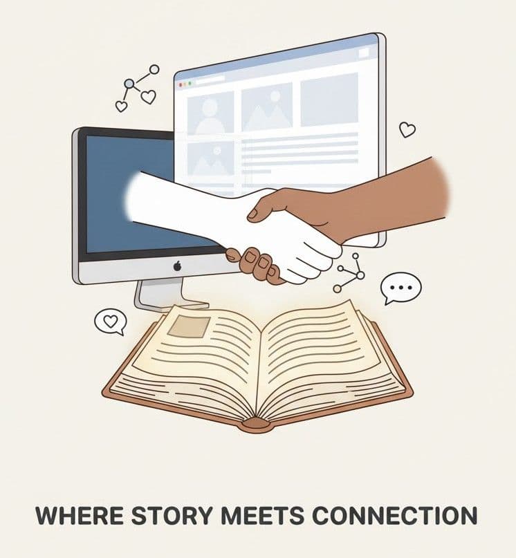
A website is not just a digital placeholder as we saw in the intro, it's your brand’s handshake, your first impression, and often, your best salesperson. From understanding the "What, Why, and How" the words that’s behind a powerful website to applying the right design psychology, you've now seen how every pixel and every second also matters.
We explored key elements that build trust with clear branding, seamless UX, with lightning speed, mobile responsiveness, and strong SEO foundations as base. We went further went into the world of design that is how colors, fonts, layouts, and minimalist strategies can emotionally shape some and how your audience feels and reacts.
Different industries might demand different design languages. What works for a luxury brand may or may not suit a tech startup or for a local bakery and that’s what makes web creation so dynamic and pushes the developer and designer to touch creativity. This sector-to-sector debate reminds us that context is like a king.
Finally, without the right tools, even the best ideas may fall and disappear like dust. Knowing the modern development tools empowers developers and businesses alike to build smarter, faster, and more and more better.
So, whatever you're starting from scratch (or) revamping (or) varnishing an old site, remember this: Your website is not just where your business lives, it's like where your story begins. Build it with a glorious purpose, design it with empathy, and let that work for you around the clock.

Author
Henry Caldwell
Web Design Strategist